Wednesday, 16 December 2009
Thursday, 26 November 2009
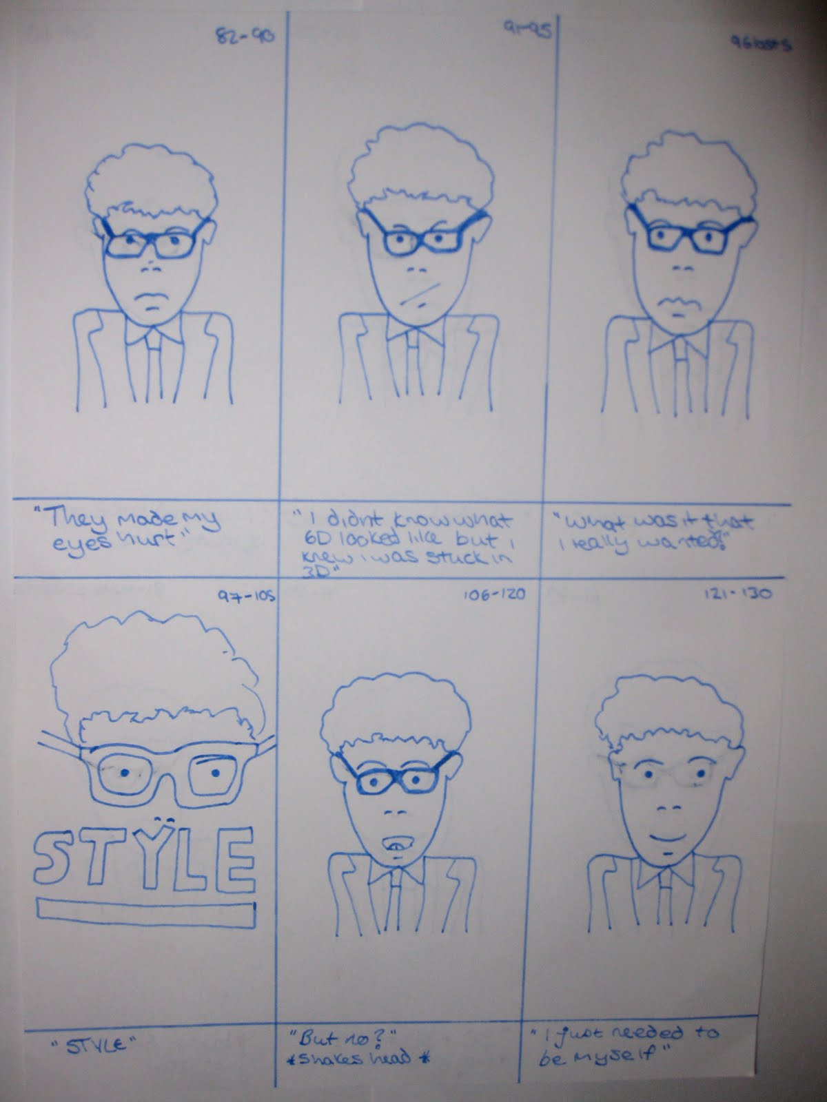
Storryboard for stop motion film

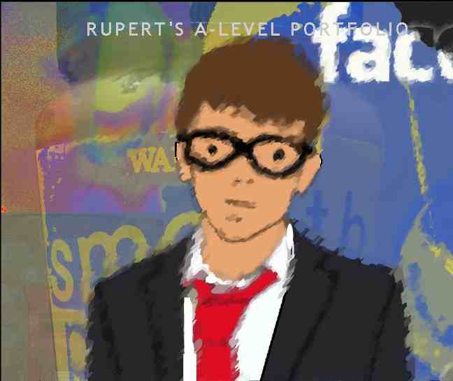
I was thinking about possible stop motion ideas and decided to create a stop motion featuring myself. I put my friends camera on a tripod and told him to take over 80 photographs of myself based on this storyboard. I then cut out the photos of myself that took about 3 hours. I had recently gone to the cinema to watch a film in 3D and got given a pair of 3D glasses so I came up with an idea featuring the 3D glasses. I also thought about how glasses are an accesory in fashion at the moment even if you have perfect vision. I created a script that can be seen below each image.
After creating the script i recorded myself speaking on a hand held camera and layered it over the top of my stop motion film. This worked quite well and I was happy with the end product however I felt I could have made it better under less time pressure as each photograph of myself wasn't perfectly placed in the position of the previous one. I chose glasses because of their relevennce to a changing landscape of gimmick accessories in fashion thoughtout the years.
I also could have done with taking more photos even though I would have had to of cut out more because it would have been slightly more interesting. I also could have done with having more money; the recoring of myself speaking didn't sound great and would have sounded a lot clearler in a recording studio. However all in all the storyboard was helpful and I was pleased with the stop motion video.
Wednesday, 11 November 2009
Photomontage

The montage on the left was done by me in the style of David Hockney's montages. I took 15 photos in all from different angles and aspects of the tray and meat products. I opened up a blank file and gradually started adding more and more images into the montage and started overlapping the images.
I thought about the idea of changing food products in a landscape; sausages are fairly new in relitive terms where as porc chops have been around for years, tin foil is fairly new whereas wood top tables have been around for hundreds of years.

My second montage was all about me and my village, I incorperated a landscape photo that I took of Beltring station, 20mins walk from my house, my guitar in the right hand corner, a ceg, an ipod, peanut butter me and my 3D glasses in the top left the local post box in the bottom left and the facebook logo I got off the internet (my village is far away from most of my friends so its a good way to contact people in an isolated area. The lightbulb in the centre is a long lasting lightbulb and so better for the environment than tradition lightbulbs. In this way societies landscape of essential products is changing with social issues such as climate change. I recently discovered a guy in the year above me that lives in my village so the light bulb also symbolises the idea of a light freeing me from boredom. I originally had a background of my friends wall with a bubble pattern and this pattern is merged into all of the photos in the montage most clearly on the top right and ceg. I used a stamp affect on most of the photos to make it more interesting and aesthetically pleasing.
Monday, 2 November 2009
Edited photograph showing a range of skills and photomontage
 I took the original photograph in Africa. I turned the photograph into a negative and selected the road. I colourized the road and tree with a red tone. I then selected certain aspects of the image such as the different mountains and changed the darkness of the mountains. I then decided that I would darken the sky and colourize it so it look dull and grey. I then went onto google and thought about the concept of a sun coming up in the background. I expanded this idea and thought about a Japanese type sun because its quite stylized and I think quite interesting. I copyed this in and put it onto a new layer behind the mountains. I then made the rays longer so they reached the edges of the photograph. I thought this was quite an interesting affect because it mixes a more realistic idea with a cartoon like aspect too it.
I researched Salvador Dalí, Man Ray and David Hockney who are three of the most famous photo montage artists. Man Ray one of the most famous photographers of the 1930s and 1940s.
Tuesday, 20 October 2009
Composite images


Wednesday, 14 October 2009
Filters

I decided that instead of taking one single image and transforming the whole thing by using one filter that I would select certain aspects of a single image and use a range of different textured filters and apply those to the selected areas.
To do this I first unlocked my layer by duplicating it. I then took the magic wand tool to select the sky and went to the filters. I decided to use one of the sketch filters and used the notepaper one. I kept it in black and white because I still wanted a bleak looking photo. I changed the hue slightly to create a light looking sky.

I then used the polygonal lasso tool and cut around the different buildings to create an image with a range of textures. I also added pieces of colour by colourizing certain area by clicking the colourize button.
I had an interesting image in terms of buildings but I thought the Thames needed to look more interesting. I cut around it and used the photocopy filter because I wanted to create a dark dirty looking river to keep in theme with the grey dull sky. I also wanted to create a prevoking image by doing this because it looks like oil that may have spilled from boats.
Wednesday, 30 September 2009
Monochrome


On the left is the original photo I took on a day out in London. First I look at the photo which I took to coincide with the title 'Changing Landscapes', I decided I wanted to empashasise the point of London being a dirty city and so changed the photo into a negaitve on photoshop. This gave the effect of a smokey sky with ghost like buildings.
 I then thought about the idea of colourizing the photo to make it more interesting. I did this by copying the original layer to unlock it and changing the hue and saturation. I clicked colourize and changed the hue to a red colour. I then changed the lightness and made the red a darker colour so I could still keep the dark dirty theme of a changed landscape alive.
This looked quite good and I felt was an improvement on both the original photo and the negative version in just black and white.
Thursday, 24 September 2009
Using Hue Saturation and lightness


After changing the colour of buildings i wanted too i opened a new window and cut out a banksy image. i then copyed it onto a layer on my existing window and moved it about. I put the image on a wall because the character looks like they are sweeping rubbish underneath the curtain and you can see the bare wall behing. I felt that this would show a good example of layers. I also used the magic wand tool to highlight the grafiti that was present already and changed the colours.
In the original image you could see the tracks (as it was taken out a train window) and so i cut these out.This is because I didnt think foreground was necessary and didnt really add anything to the final image. I decided to leave the sky in black and white because I felt if it had been a big blue sky the viewers eye would have been drawn away from the buildings.
Wednesday, 23 September 2009
Skills Develpment

